UX & CRO Design
Harwoods Homepage Redesign
Redesigned a premium automotive homepage using data led insights and user testing to improve hierarchy, trust, and engagement for high intent users.
Year :
2025
Industry :
Automotive
Client :
Harwoods Group
Project Duration :
2 months
Team:
Designer (Me) and 1 Developer

A HOMEPAGE THAT WAS WORKING AGAINST ITS USERS
The Harwoods homepage redesign focused on improving visual impact, clarity, and engagement for high intent users browsing premium vehicles and services. The existing homepage struggled to clearly communicate brand value, surface key categories, and guide users efficiently, resulting in friction and unnecessary scrolling. The goal was to create a cleaner, more confident, and user led homepage experience.

HOW I RESEARCHED, DESIGNED & VALIDATED
I analysed GA4 traffic data across desktop and mobile, alongside scroll depth and heatmaps from MS Clarity to identify friction points. Also listed out hypotheses on the strategy roadmap for internal and client visibility and tracking.
I redesigned key homepage sections and explored 1-3 design variations per section. These were tested against the current homepage using preference testing via Lyssna, gathering direct feedback from target users.
I compiled offline preference testing insights into clear test reports for client sign off, helping secure approval for development, and live A/B testing.
FROM ANALYTICS TO HANDOVER
Data & Behaviour Analysis
Reviewed analytics, heatmaps, and session recordings to understand drop offs and engagement gaps.
User Research
Tested design variations offline with over 100 users to validate hierarchy, messaging clarity, and trust signals.
Hypothesis Creation
Formed clear UX hypotheses around simplifying navigation, improving visual hierarchy, and strengthening brand.
WIREFRAMING & VISUALS
Explored multiple layout directions focused on clarity, accessibility, and commercial intent.
Experimentation
Launched structured A B tests to measure impact against defined success metrics.
Optimisation & Rollout
Refined the winning direction and aligned with stakeholders to support rollout and ongoing optimisation.
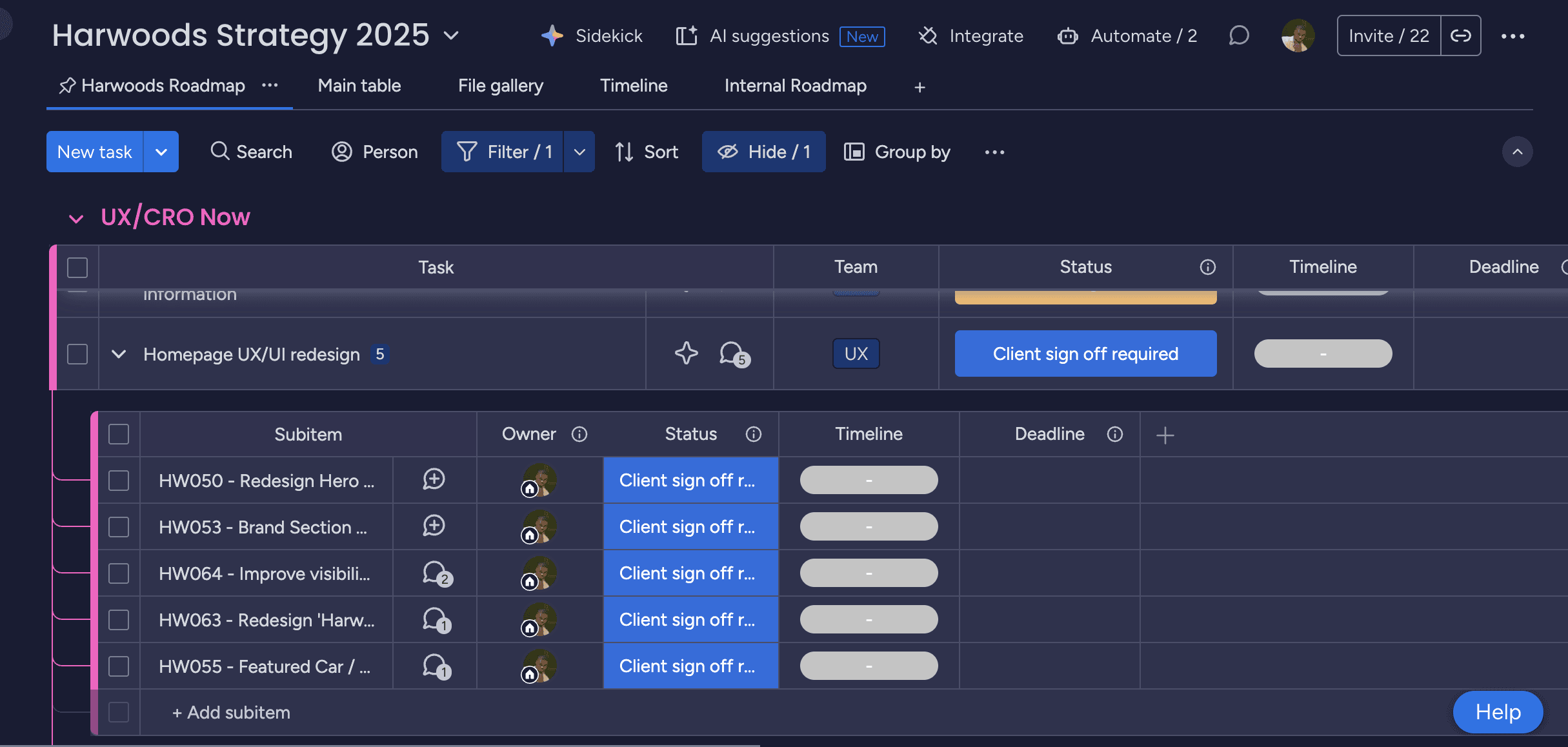
I used Monday.com to project manage and send updates, both internally for Clickthrough and client side for Harwoods:
HOW I RESEARCHED, DESIGNED & VALIDATED
Below is the final UX execution and handover at each breakpoint, supported by annotation. This was signed off and sent to the client to be built and deployed, whilst in the meantime we ran a few A/B tests for them.
HOW I RESEARCHED, DESIGNED & VALIDATED

Key sections redesigned and user tested:
Search
Browse by brand
Service & repairs
Harwoods Assured
Latest cars in stock
THE ORIGINAL

THE REDESIGN

CHALLENGE: WRITING UNBIASED TEST QUESTIONS
When it came to A/B preference testing the each homepage section on Lyssna, it was sometimes difficult outlining the context and intent of each redesign, without being biased and pushing for the redesigned variations(s). Similarly, not giving enough context, a user scenario, or full design clarity, did at times result in users preferring the current version. To counter this, I would iterate and use AI to assist in framing the test questions in a balanced unbiased format , and sense check these with my manager before releasing the tests.

72% USER PREFERENCE. 55% PROJECTED UPLIFT
View Prototype
After testing this with 100+ users, 72% of users consistently preferred the redesigned homepage over the current version, citing its cleaner layout, clearer hierarchy, and improved access to essential information above the fold.
My redesign reduced visual clutter, surfaced trust signals earlier, and improved scannability across product listings. Through UX experimentation, this redesign is projected to increase conversion rate by 55%.
WHAT THIS PROJECT TAUGHT ME
Data Builds Momentum
Combining analytics, heatmaps, and user testing made the case for redesign clear and helped move decisions forward with confidence.
Hierarchy Drives Confidence
Clear sectioning, spacing, and prioritization of trust signals significantly improved user reassurance and engagement.
Testing Reduces Risk
Validating design changes with real users before build ensured stronger outcomes and smoother client alignment.
This is just a snapshot of the entire design process. Reach out for the full story!
Find out more
More Projects
UX & CRO Design
Harwoods Homepage Redesign
Redesigned a premium automotive homepage using data led insights and user testing to improve hierarchy, trust, and engagement for high intent users.
Year :
2025
Industry :
Automotive
Client :
Harwoods Group
Project Duration :
2 months
Team:
Designer (Me) and 1 Developer
A HOMEPAGE THAT WAS WORKING AGAINST ITS USERS
The Harwoods homepage redesign focused on improving visual impact, clarity, and engagement for high intent users browsing premium vehicles and services. The existing homepage struggled to clearly communicate brand value, surface key categories, and guide users efficiently, resulting in friction and unnecessary scrolling. The goal was to create a cleaner, more confident, and user led homepage experience.
HOW I RESEARCHED, DESIGNED & VALIDATED
I analysed GA4 traffic data across desktop and mobile, alongside scroll depth and heatmaps from MS Clarity to identify friction points. Also listed out hypotheses on the strategy roadmap for internal and client visibility and tracking.
I redesigned key homepage sections and explored 1-3 design variations per section. These were tested against the current homepage using preference testing via Lyssna, gathering direct feedback from target users.
I compiled offline preference testing insights into clear test reports for client sign off, helping secure approval for development, and live A/B testing.
FROM ANALYTICS TO HANDOVER
Data & Behaviour Analysis
Reviewed analytics, heatmaps, and session recordings to understand drop offs and engagement gaps.
User Research
Tested design variations offline with over 100 users to validate hierarchy, messaging clarity, and trust signals.
Hypothesis Creation
Formed clear UX hypotheses around simplifying navigation, improving visual hierarchy, and strengthening brand.
WIREFRAMING & VISUALS
Explored multiple layout directions focused on clarity, accessibility, and commercial intent.
Experimentation
Launched structured A B tests to measure impact against defined success metrics.
Optimisation & Rollout
Refined the winning direction and aligned with stakeholders to support rollout and ongoing optimisation.
I used Monday.com to project manage and send updates, both internally for Clickthrough and client side for Harwoods:
HOW I RESEARCHED, DESIGNED & VALIDATED
Below is the final UX execution and handover at each breakpoint, supported by annotation. This was signed off and sent to the client to be built and deployed, whilst in the meantime we ran a few A/B tests for them.
HOW I RESEARCHED, DESIGNED & VALIDATED
Key sections redesigned and user tested:
Search
Browse by brand
Service & repairs
Harwoods Assured
Latest cars in stock
THE ORIGINAL
THE REDESIGN
CHALLENGE: WRITING UNBIASED TEST QUESTIONS
When it came to A/B preference testing the each homepage section on Lyssna, it was sometimes difficult outlining the context and intent of each redesign, without being biased and pushing for the redesigned variations(s). Similarly, not giving enough context, a user scenario, or full design clarity, did at times result in users preferring the current version. To counter this, I would iterate and use AI to assist in framing the test questions in a balanced unbiased format , and sense check these with my manager before releasing the tests.
72% USER PREFERENCE. 55% PROJECTED UPLIFT
View Prototype
After testing this with 100+ users, 72% of users consistently preferred the redesigned homepage over the current version, citing its cleaner layout, clearer hierarchy, and improved access to essential information above the fold.
My redesign reduced visual clutter, surfaced trust signals earlier, and improved scannability across product listings. Through UX experimentation, this redesign is projected to increase conversion rate by 55%.
WHAT THIS PROJECT TAUGHT ME
Data Builds Momentum
Combining analytics, heatmaps, and user testing made the case for redesign clear and helped move decisions forward with confidence.
Hierarchy Drives Confidence
Clear sectioning, spacing, and prioritization of trust signals significantly improved user reassurance and engagement.
Testing Reduces Risk
Validating design changes with real users before build ensured stronger outcomes and smoother client alignment.
This is just a snapshot of the entire design process. Reach out for the full story!
Find out more