Case Study
USDA.gov site Redesign and Rebuild
Modernizing USDA.gov: Designing for Accessibility, Engagement & Support
Year :
2024
Industry :
Government
Client :
USDA.gov
Project Duration :
2 weeks (ongoing)

Overview
This project is created to explore how a large-scale government platform could be made more accessible, navigable, and user-friendly without losing authority or trust.
Starting from a full UX/UI case study deck, the project was rebuilt in code to test how design decisions hold up in a real browser environment, focusing on navigation complexity, content density, and responsive behaviour across multiple page types.
Objective:
Simplify a complex IA
Rework USDA.gov’s dense navigation and content structure into clearer, more scannable pathways for diverse user needs.
Translate public-sector UX into real code
Move beyond static mockups and rebuild the redesign using HTML, CSS, and JavaScript to validate layout, interaction, and hierarchy.
Explore scalable front-end patterns
Test how repeatable components (navigation, cards, grids, sidebars) could scale across multiple sections and page types.

Actions :
Rebuilt key USDA.gov pages using semantic HTML and modular CSS
Implemented complex navigation patterns including mega menus, dropdowns, and breadcrumbs
Added interactive behaviours with JavaScript to support search, carousels, menus, and UI feedback
key features explored:
Navigation & mega menus
A multi-level navigation system was built to reflect USDA’s complex structure, balancing discoverability with clarity.
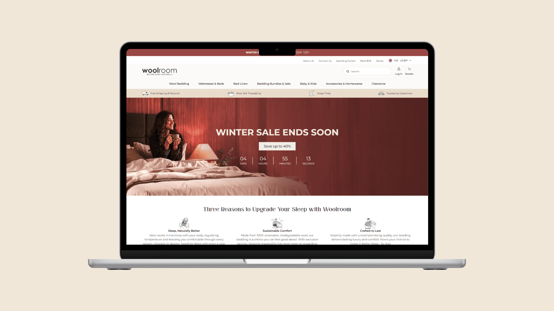
Homepage content hierarchy
redesigned and rebuilt to prioritise key messages, services, and featured content while reducing cognitive overload.
'Interests' page
“Interests” pages allow users to explore topics through visual grids, making dense categories more intuitive.
Detail pages with navigation
Secondary pages (e.g. Urban Agriculture) introduce sidebar navigation and breadcrumbs to support deeper content exploration without disorientation.
Interactive components
Interactive elements such as carousels, dropdowns, search expansion, and hover states were implemented using JavaScript to reinforce usability.
Responsive navigation
Mobile navigation patterns were explored to manage large menus and search interactions within limited screen space.
Actions :

Tech stack:
HTML
CSS
JavaScript
Figma
Github

Challenge :
One of the main challenges was managing the scale and complexity typical of government websites. Designing and building navigation that could handle dozens of categories without overwhelming users required careful hierarchy, spacing, and interaction design. Translating a visually polished redesign into raw HTML and CSS also surfaced practical constraints around responsiveness, hover-based interactions, and content flow. Ensuring consistency across multiple page types while avoiding over-engineering was an ongoing balance throughout the build.
Result :
Live Site
The result is a live, multi-page front-end prototype that demonstrates how a large public-sector website could feel more modern, approachable, and usable while retaining credibility. The project serves as a practical bridge between UX redesign and real implementation, validating design decisions through code rather than static visuals alone.
Key next steps:
Responsiveness
Continue improving mobile and tablet layouts, particularly around navigation density, dropdown behaviour, and content stacking.
Content depth & page expansion
Add additional sections and page templates to further test scalability across more USDA topics and services.
UI & interaction polish
Refine spacing, typography, hover states, and micro-interactions so the build more closely matches the original UI redesign.
This is just a snapshot of the entire design process. Reach out for the full story!
Find out more
More Projects
Case Study
USDA.gov site Redesign and Rebuild
Modernizing USDA.gov: Designing for Accessibility, Engagement & Support
Year :
2024
Industry :
Government
Client :
USDA.gov
Project Duration :
2 weeks (ongoing)
Overview
This project is created to explore how a large-scale government platform could be made more accessible, navigable, and user-friendly without losing authority or trust.
Starting from a full UX/UI case study deck, the project was rebuilt in code to test how design decisions hold up in a real browser environment, focusing on navigation complexity, content density, and responsive behaviour across multiple page types.
Objective:
Simplify a complex IA
Rework USDA.gov’s dense navigation and content structure into clearer, more scannable pathways for diverse user needs.
Translate public-sector UX into real code
Move beyond static mockups and rebuild the redesign using HTML, CSS, and JavaScript to validate layout, interaction, and hierarchy.
Explore scalable front-end patterns
Test how repeatable components (navigation, cards, grids, sidebars) could scale across multiple sections and page types.
Actions :
Rebuilt key USDA.gov pages using semantic HTML and modular CSS
Implemented complex navigation patterns including mega menus, dropdowns, and breadcrumbs
Added interactive behaviours with JavaScript to support search, carousels, menus, and UI feedback
key features explored:
Navigation & mega menus
A multi-level navigation system was built to reflect USDA’s complex structure, balancing discoverability with clarity.
Homepage content hierarchy
redesigned and rebuilt to prioritise key messages, services, and featured content while reducing cognitive overload.
'Interests' page
“Interests” pages allow users to explore topics through visual grids, making dense categories more intuitive.
Detail pages with navigation
Secondary pages (e.g. Urban Agriculture) introduce sidebar navigation and breadcrumbs to support deeper content exploration without disorientation.
Interactive components
Interactive elements such as carousels, dropdowns, search expansion, and hover states were implemented using JavaScript to reinforce usability.
Responsive navigation
Mobile navigation patterns were explored to manage large menus and search interactions within limited screen space.
Actions :
Tech stack:
HTML
CSS
JavaScript
Figma
Github
Challenge :
One of the main challenges was managing the scale and complexity typical of government websites. Designing and building navigation that could handle dozens of categories without overwhelming users required careful hierarchy, spacing, and interaction design. Translating a visually polished redesign into raw HTML and CSS also surfaced practical constraints around responsiveness, hover-based interactions, and content flow. Ensuring consistency across multiple page types while avoiding over-engineering was an ongoing balance throughout the build.
Result :
Live Site
The result is a live, multi-page front-end prototype that demonstrates how a large public-sector website could feel more modern, approachable, and usable while retaining credibility. The project serves as a practical bridge between UX redesign and real implementation, validating design decisions through code rather than static visuals alone.
Key next steps:
Responsiveness
Continue improving mobile and tablet layouts, particularly around navigation density, dropdown behaviour, and content stacking.
Content depth & page expansion
Add additional sections and page templates to further test scalability across more USDA topics and services.
UI & interaction polish
Refine spacing, typography, hover states, and micro-interactions so the build more closely matches the original UI redesign.
This is just a snapshot of the entire design process. Reach out for the full story!
Find out more